
Many designers and developers view accessibility as an afterthought. However, adhering to accessibility best practices leads to a higher customer retention rate and increases generated revenue. Browsers have evolved with more features to support accessibility.
I wrote an article for LogRocket on Which Chrome DevTools improve accessibility?. The tutorial explains how to boost accessibility with Lighthouse audits, Chrome's accessibility pane, and other features to improve user retention and revenue on your site.
Read the article on LogRocket blog or continue below.
In this article, you’ll learn how to leverage Chrome Developer Tools (DevTools) to identify and fix the accessibility bottlenecks of web pages you build.
This article is for people who are familiar with accessibility best practices. You also need to have a basic understanding of DevTools.
Overview
As a frontend engineer who cares about how software solutions I build improve user experience, I use Chrome DevTools a lot.
Chrome DevTools is a suite of web developer tools built into the Google Chrome browser. It divides into a series of panels which are further organized into panes.
Try navigating a web page with a keyboard or assistive technology. Is the experience smooth? Are the elements standard-compliant? What can you do to improve its current state? With DevTools, you can identify and fix these issues.
To access the DevTools panel, visit the webpage you want to audit using Google Chrome. Then, use the shortcut Command + Shift + C on a Mac or Control + Shift + C on Windows and Linux to view the DevTools.
You would explore the different accessibility-related features in Chrome DevTools:
- Lighthouse Audits panel
- Elements Inspector
- Contrast Ratio
- Accessibility Pane
- Emulating Colour Preferences
- Emulating Vision Deficiencies
Lighthouse Audits Panel
The Lighthouse Audits panel powered by aXe is a good tool for auditing accessibility. The audit report is informative. It states what failed, why it failed, and provide links to resources to help you learn more.
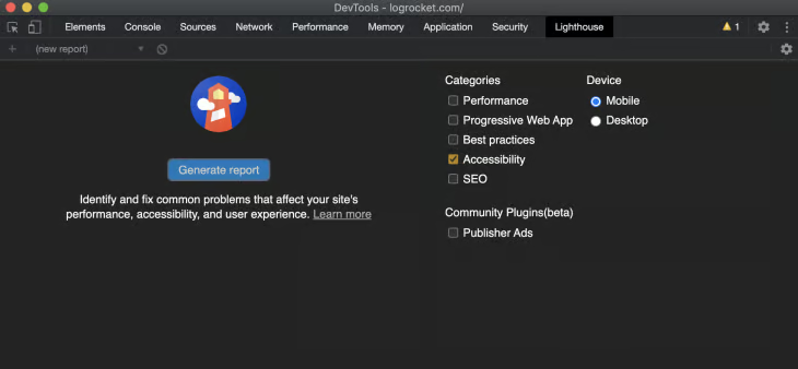
To audit a webpage, first open DevTools and click the Lighthouse panel. Uncheck other options, leaving only the accessibility option checked.
Then, select the device you’d like to perform an audit on and click Generate Report.
Click the various sections of the generated report for tips on improving the accessibility score. The details on the passed audits are also useful.
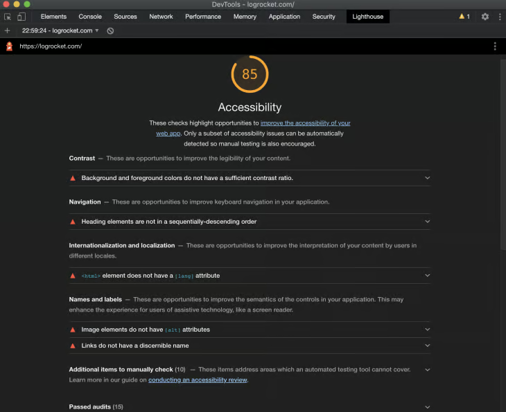
There is detailed audit documentation for heading order provided as a resource for a failed heading order.
It specifies the importance of the element that failed, how the Lighthouse heading levels audit fails, and how to fix poorly structured headings, among other information.
Elements inspector
The Inspect Element feature in DevTools gives you access to a tooltip with accessibility features at a glance. It shows up whenever you inspect an element on a web page.
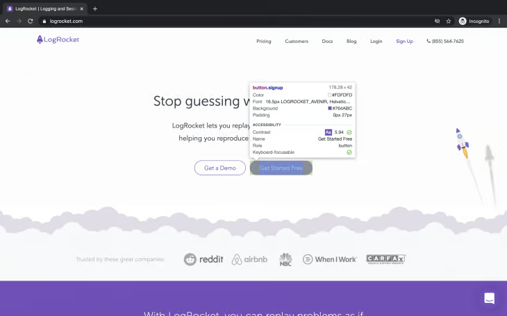
It displays the following properties:
- Contrast Ratio: Measures the difference in brightness between the foreground and background color of the text.
- Name: The visible text
- Role: The function of the element (region, heading, button etc.). It displays “generic” for elements like
<div>and<span>that have no semantic meaning - Keyboard-focusable: Shows if you can focus on an element using your keyboard. A grey color shows that the element is not keyboard-focusable. Green shows that the element is keyboard-accessible.
Contrast Ratio
The Contrast Ratio feature measures the difference in brightness between the foreground and background color of the content of web pages. This will help when choosing the color scheme for your web pages during the design phase. Always ask yourself if the color you are about to choose meets the accessibility standard.
A high contrast ratio is the desired value for any content viewed by users. Low vision users or users affected by environmental factors may not be able to see the content on your web page if you don’t maintain a high contrast ratio.
Imagine a user viewing a web page with a low contrast ratio under the effect of sunlight. The user’s experience would be terrible.
WCAG requires “at least 4.5:1” contrast, so you cannot round a contrast ratio up to 4.5:1. For example, #777777 is a commonly-used shade of gray with a 4.48:1 contrast ratio. It does not meet the WCAG contrast threshold. Contrast and Color Accessibility
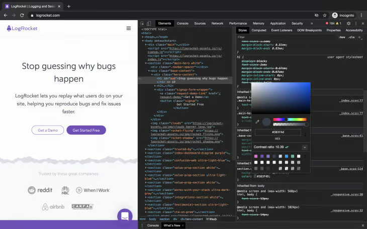
The Contrast Ratio section of the Color Picker shows 2 checkmarks and the value of 10.39.
You can use the color picker to choose colors that meet the standard. To access this feature, inspect a text using the Element Inspector tool. Then, locate the color property on the styles pane.
Click the elements color preview, which is a small square on the left-hand side of the value. Locate the current contrast ratio section and click on the downward pointing arrow to view more details.
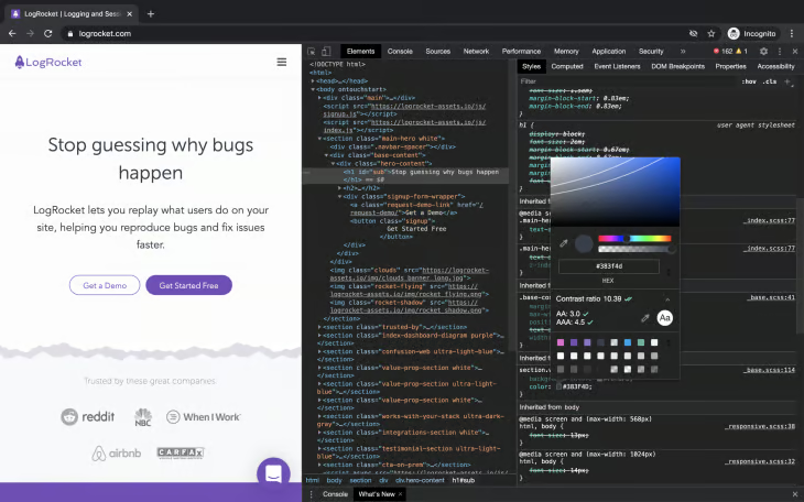
A single checkmark indicates that the element meets the minimum recommendation (AA). Strive to meet the enhanced recommendation (AAA) indicated by two checkmarks.
A line or two appears on the color palette. Clicking on the region a bit higher reduces it to the minimum recommendation. Anything beyond that would not meet the minimum recommendation.
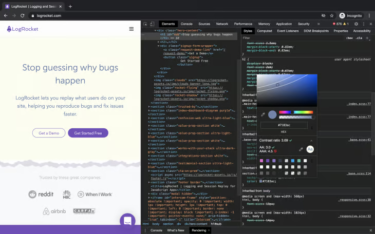
The Contrast Ratio section of the Color Picker shows 1 checkmark and a value of 3.69.
Accessibility pane
The Accessibility pane provides insight into the accessibility tree, ARIA attributes, and computed accessibility properties of DOM nodes.
You may already be familiar with ARIA, but here’s a brief description for those who do not know what it is.
Accessible Rich Internet Applications (ARIA), referred to as the Web Accessibility Initiative Accessible Rich Internet Applications (WAI-ARIA), is defined by WAI as a way to make web content and web applications (especially dynamic content and advanced user interfaces) more accessible to people with disabilities.
Check out the code snippet for a modal below:
<div aria-modal="true">Add modal content</div>The aria-modal attribute adds semantic meaning to the div. Assistive technologies such as a braille or screen reader would perceive the div as a modal, which is the intended behavior.
ARIA however, may hurt the accessibility of web pages if not properly used. Note the first rule of ARIA use:
If you can use a native HTML element [HTML5.1] or attribute with the semantics and behavior you require already built in, instead of re-purposing an element and adding an ARIA role, state or property to make it accessible, then do so. - Using ARIA
To use the accessibility pane, open DevTools. Then, inspect any element on the page. Click the accessibility pane located under the elements panel.
The accessibility pane is often hidden, so open DevTools and press Command+Shift+P on Mac or Control+Shift+P on Windows and Linux to open the command menu. The command menu is an autocomplete search field. Search for Show Accessibility, and then press Enter to run a command that opens the pane.
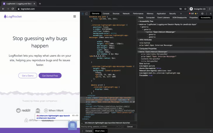
The information on the accessibility tree displays elements from the DOM tree that are useful for perceiving the content of the page by assistive technologies.
ARIA attributes list the properties on these elements. The computed properties section displays properties computed by the browser.
It’s okay if the inspected element has no value specified for these ARIA attributes and properties. Semantic elements do not need them, as they already have meaning.
Going through these details will help you check if you are building for a wider audience or restricting your scope.
Emulating color preferences
Dark mode helps the eyes by exposing it to less light. You can use the DevTools to simulate how users perceive your web pages. The available options are no-preference, light, and dark.
Note: This is only available on websites that implement the Media Queries Level 5 user preference media feature.
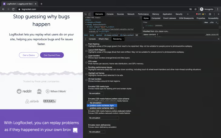
To access this feature, open DevTools and press Command+Shift+P on Mac or Control+Shift+P on Windows and Linux to open the Command Menu. Then, search for and select Show Rendering to enable the rendering tab.
Finally, navigate to Emulate CSS media feature prefers-color-scheme section and select an option from the available options.
Emulating vision deficiencies
Emulating vision deficiencies is one of the key accessibility features to use to ensure that you leave no user behind. Consider not using color or images alone to convey information. Chrome DevTools has this feature built-in.
To access this feature, open DevTools and press Command+Shift+P on Mac or Control+Shift+P on Windows and Linux to open the Command Menu. Then, search for and select Show Rendering to enable to rendering tab. Navigate to the Emulate Vision Deficiencies pane and select an option from the available options.
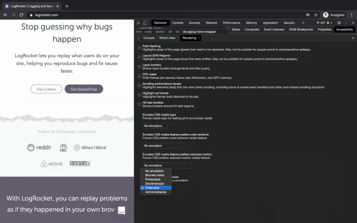
The available options are:
- No emulation: No vision deficiency
- Blurred vision: Decreased clarity in vision
- Protanopia: Inability to perceive red light
- Deuteranopia: Inability to perceive green light
- Tritanopia: Inability to perceive blue light
- Achromatopsia: Absence of color vision. Sees only black, white, and shades of grey.
Knowing that people who visit your website do not always perceive it as you do will help you build each feature you ship with accessibility in mind.
Conclusion
DevTools have evolved with more features to support accessibility that are not known by developers. In this article, you explored features you can leverage to improve website accessibility.
You used the Lighthouse Audits panel to audit the web page and fix failed audits, as well as the Elements Inspector to view the contrast ratio, name, role and keyboard-focusable properties at a glance. You used Contrast Ratio to ensure that foreground and background colors meet the recommended contrast ratio. Finally, You used the Accessibility Pane to gain insight into the accessibility tree, ARIA attributes and computed accessibility properties of DOM nodes.
You also emulated color preferences and vision deficiencies your users may have.