
Cascading Style Sheet (CSS) is well known in web development as the flesh of HTML documents. While HTML gives a website its structure, CSS deals with the presentation. It makes websites visually appealing while handling responsiveness using media queries.
A lot of developers hate writing CSS. Some prefer to just write the back-end logic and move on to something else. "I'll write anything but definitely not CSS" some will say.
What if you can really write good CSS? What if you believe you suck at it as a result of not giving yourself enough time to appreciate the language and learn how to write it in a better way? What if this hatred is as a result of an improperly structured codebase?
All there is to CSS is mastering the selectors, properties, values and specificity. Writing CSS is not complicated but it can be when working on big projects if not properly structured. It requires patience and love for artistry to excel if we intend to design usable web applications. The key here is to be consistent.
In my previous post, Writing Standards-Compliant-HTML, I listed a couple of guidelines we need to follow to build accessible websites or web applications. In this article, we will be looking at ways to write clean and maintainable CSS.
What we need to consider
- Readability
- Reusability
- Maintainability
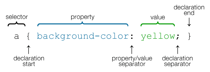
What do we need to know?
selector {
    property: value;
}
As straightforward as this syntax is, there are things we don't get right when using it. We will be looking into some of them in detail.
Style Import
When linking the stylesheet to our HTML document, having to write the file type is unnecessary. This is implied already.
/* bad code */
<link rel="stylesheet" href="path_to_file.css" type="text/css">

/* good code */
<link rel="stylesheet" href="path_to_file.css">
Code format
CSS selectors, properties, and values should be written in lowercase. Having it all in uppercase makes the stylesheet look clumsy.
/* bad code */
.site-body {
  DISPLAY: FLEX;
}

/* good code */
.site-body {
  display: flex;
}
Quotation marks
Property values should be enclosed in single quotation marks (' ') rather than double quotation marks (" ").
html,
body {
  font-family: 'Helvetica Neue', georgia, serif;
}
Box Model
We need a proper understanding of the box model to determine where padding, border and margin applies and use them appropriately. They all consist of a width and a height.
-
Content: Each content on a web page takes up a rectangular space with a width and a height. The content is what is displayed on the web page. It is the inner-most part of the box.
-
Padding: This is the transparent area surrounding the content.
-
Border: This area (if present) surrounds the padding and the content
-
Margin: This separates the element from other elements in the DOM. It is the transparent outer-most layer that surrounds the border.
Naming Convention
Looking at id and class names, we should be able to decipher the content being styled. Names chosen should not be unnecessarily long. We need to make it short and meaningful.
/* bad code */
.green-notification {
  color: #15c39a;
}

/* good code */
.success-alert {
  color: #15c39a;
}
In the code above, what happens when UI/UX engineers propose a change of color? This will affect not only the content of the styled element, but the name and HTML file(s) involved. Names should define the content or function (what it does) NOT the presentation (how it looks) of the element.
You can opt for the BEM - Block, Element, Modifier (.block__element--modifier) naming convention. It is a widely-used convention in most big projects though outside the scope of this article. E.g.
  .orderedList__item--active {
    border-bottom: 1px dashed #a974bf;
    color: #ad58ad;
  }
Specificity
Sometimes, when we style elements and expect them to reflect, they act otherwise leaving us wondering what went wrong. This is as a result of CSS specificity.
It determines the rule applied by web browsers depending on the element's position on the hierarchy.
By default, inline CSS is considered first before internal or external CSS. The order of precedence from highest to lowest is:
!importanttakes precedence over all declared styles.- inline CSS (html style attribute) overrides CSS rules in style tag and external stylesheets
- a more specific selector takes precedence over a less specific one
- rules that appear later in the code override earlier rules if both have the same specificity.
For single selectors from highest to lowest:
- Inline styles (
<nav style="color: #fff;">) - IDs (
#myId) - Classes (
.myclass), attributes ([type="checkbox"]) and pseudo-classes (:hover). - Elements (
ul) and pseudo-elements (::before).
We need to understand CSS specificity to help us make better decisions when styling our documents and avoid spaghetti code.
Enforced Styles
Do you see !important everywhere when checking out styles used on a website? That is a sign of an unstructured CSS codebase. !important overrides previously declared styles. This should be avoided as much as possible. The more it appears in a codebase, the more the codebase becomes messed up and difficult to maintain.
Shorthand Properties
The more concise, the better. We should opt for shorthand properties in cases where it can be used.
/* bad code */
selector {
  margin-top: 10px;
  margin-right: 20px;
  margin-bottom: 10px;
  margin-right: 20px;
}

/* good code */
selector {
 margin: 10px 20px;
}
Hex Code
We should always use three (3) character hexadecimal code where possible since they yield the same result as the six (6) character equivalent. According to websiteoptimization.com, shorthand hexadecimal colors can help optimize style sheets, especially when combined with shorthand properties and grouping. The only exception should be when the named equivalent is shorter e.g. gray.
selector {
  color: #fc0;
}
Unit
Properties having zero (0) as its value should not be assigned a unit as it makes no difference.
/* bad code */
selector {
  margin-top: 0px;
  margin-bottom: 0%;
}

/* good code */
selector {
  margin-top: 0;
  margin-bottom: 0;
}
Group Selectors and Declarations
To create compact yet powerful CSS rules, always group selectors and declarations.
/* bad code */
body {
  font-size: 1rem;
}

th {
  font-size: 1rem;
}

/* good code */
body,
th {
  font-size: 1rem;
}
Sort properties
To make rules readable, arrange the properties in alphabetical order.
selector {
  color: #ad58ad;
  margin: 0;
  padding: 0;
}
Setting width on inline elements
Sometimes, we find ourselves setting width on an inline element without adding display property to change it to a block element.
.inline-element {
  background: #ffb40f;
  height: 50px;
  width: 200px;
}

.inline-element--two {
  display: block;
}
Notice the difference between the two elements above. By adding display: block; to the second element, the width and height properties took effect. Adding display: block; to block elements means introducing redundant code to our codebase and should be avoided.
Hover state on disabled elements
When elements are disabled, we need to convey it clearly to the users. Hovering over the buttons below, the buttons behave differently. Instead of giving room for deadclicks like in the first button, we need to use the approach applied in the second one.
.hover-state {
  cursor: pointer;
}

.hover-state--two:disabled {
  cursor: not-allowed;
}
Not providing fall backs
Using caniuse, we can detect properties that are not supported across all browsers. Rather than going ahead to use the properties, we can show empathy by providing fallbacks.
Collapsing divs
We need to apply certain rules on divs housing floated elements to avoid what we see in case 1 below.
Notice the difference between the two cases presented. If we don't understand what is happening when faced with this scenario, we may end up trying to enforce unneccessary styles to achieve what we want when we could have just applied the styles shown below to the floats-container.
.floats-container::before,
.floats-container::after {
  content: " ";
  display: table;
}

.floats-container::after {
  clear: both;
}
Keep it DRY
Don't repeat yourself (DRY) in a codebase. We need to group things and use variables whenever we can. We don't need to set the theme color for every element that needs it. Providing the ability to update all instances once the declaration is changed makes the code easy to refactor.
:root {
  --primary-color: #ad58ad;
}

.nav {
  background-color: var(--primary-color);
}
Code for mobile users first
Code for mobile users first and then progressively enhance for tablets and desktops. Compare this to coding for desktop first, where heavy components are loaded by default and then hidden for small screens (known as "graceful degradation").
Given:
<div class="image"></div>Here's an example of coding for desktop first:
<style>
.image {
   background-image: url(image1.jpg);
}
@media (max-width:390px) {
   .image {
      display: none;
   }
}
</style>
In the above code, the default is to display the image, which is then overruled for mobile devices with the media query.
Here's an example of coding for mobile first:
<style>
@media (min-width:391px) {
   .image {
      background-image: url(image1.jpg);
   }
}
</style>
By default, the image isn't displayed, while wider screens are progressively enhanced using a media query.
Code Validation
W3C Validator can help us pinpoint areas that we might miss when writing our stylesheets.
Conclusion
Knowing the right property to use at the right time will curb the stress we go through while styling web pages. So, let's not hate CSS. Let's practice more and we will come to love what we can achieve with it.